Viby • Concept 2025
Food recs from people you actually trust
Role
UI/UX Design
Timeline
Nov 2025 – Present
Team
Startup
Skills/Technology
Figma
Design systems
Prototyping
IA
Overview
The next spot should come from friends, not a stranger's five stars.
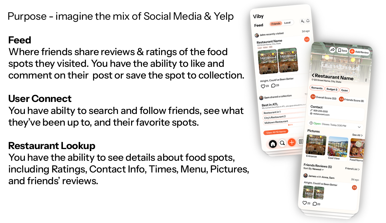
Viby is a social food diary, somewhere between a feed and a review site. I designed the product in Figma: the information architecture, the screen flows, and the visual system, so a founding team could argue about a real interface instead of a pitch deck.
Two scores
Every place shows an overall rating and a separate friends rating. The number from people you follow is the one the product is actually about.
Collections, not bookmarks
Saved spots become named lists you can keep private, publish, or save from someone else's library.
Posting is the loop
A review is a small social act: tag who you went with, order your photos, rate it, say the one honest sentence.
Problem
A 4.6 from ten thousand strangers tells you almost nothing.
Review platforms aggregate people whose taste you have no reason to share, which is why the actual decision still happens in a group chat. The recommendation you trust already exists; it is just trapped in a thread, unsearchable, and gone in a week. The design problem was giving that conversation somewhere structured to live without turning it into homework.
Signal is social
Whose opinion it is matters more than how many opinions there are. The interface has to show the who before the score.
Capture has to be fun
Nobody writes a paragraph about lunch. If posting is not as light as a story, the graph never fills up.
Cold start is a design problem
Before you follow anyone, the app still has to be worth opening, so browse leads with curated lists, not an empty feed.
System
Warm, because the product is about appetite.
Color and type
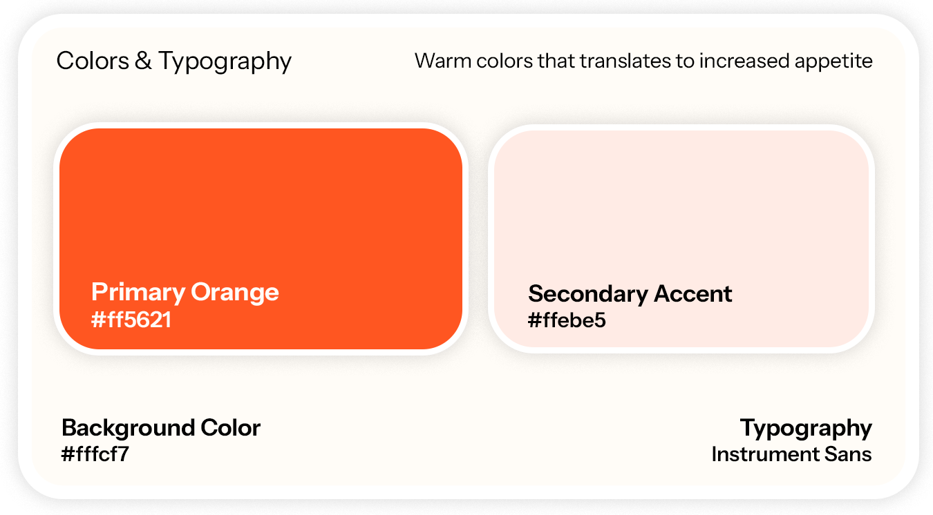
A saturated orange primary on a warm off-white ground, with a pale tint for surfaces and Instrument Sans throughout. Warm hues to read as appetite, and exactly one accent so the action to take is never ambiguous.
Three surfaces
Feed for what friends have been eating, user connect for finding and following them, and restaurant lookup for everything about one place: ratings, hours, contact, photos, and the friends' reviews that matter most.
Flows
Find it, keep it, post it.
Browse
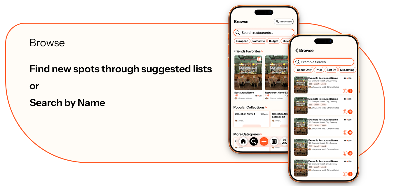
Two ways in: discover through friends' favorites, popular collections, and mood chips like romantic, budget, or quiet, or search by name and narrow with friends-only, price, and minimum rating. Every result carries the line that does the work: which friends have been there.
Collections
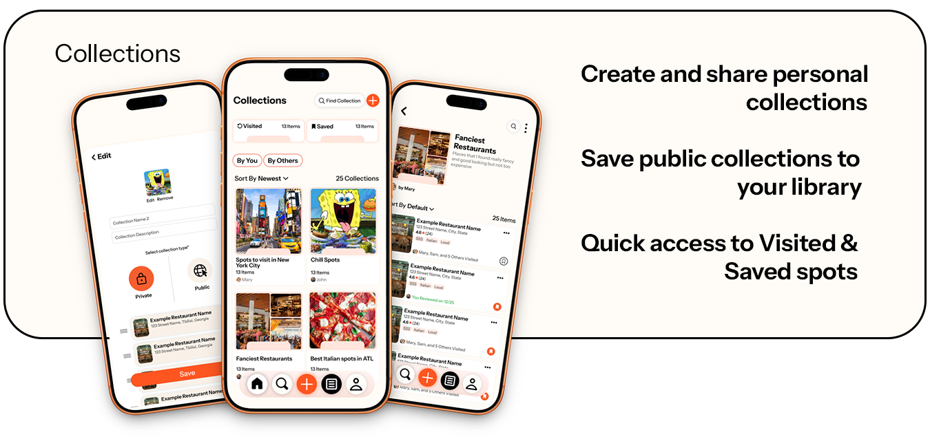
Visited and saved are always one tap away. Beyond that, users build named lists with a cover image, choose private or public, and save other people's collections into their own library: the mechanic that lets taste spread without a follow.
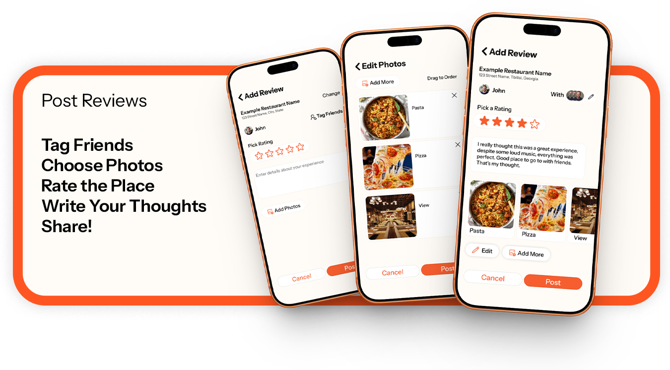
Posting a review
Tag the friends you went with, add photos and drag them into order, label each one so a dish is findable later, pick a rating, and write the short honest take. The flow is deliberately three light screens instead of one long form.
Reflection
What I learned
The score is the product decision.
Splitting one rating into overall and friends looks like a UI detail and is actually the entire thesis. Designing it as two numbers on the same row forced the team to be explicit about which one we believe.
Design the empty state first.
A social app is at its worst on day one. Leading browse with curated collections and categories, instead of a feed that has nothing in it, was the difference between a concept that demos and one that only works at scale.
A visual system is a decision log.
Fixing the palette and type early meant every later screen was a layout question, not a taste argument. That is the part of design work that actually speeds a team up.